Back
OrangeWork Hub: Replacing paper schedules with a mobile app for Syracuse University student workers
Syracuse University Food Services managed 200+ student shifts on paper. I designed a mobile app that lets students view, schedule, swap, and drop shifts without ever needing to track down a supervisor.
My Role
Sole Designer (end-to-end)
Timeline
16 Weeks
Team
Just me. Solo project
The Problem
Syracuse University Food Services scheduled student workers using a paper sign-up sheet and communicated shift changes over Outlook email. It worked, sort of, until it didn't.
The main pain point was shift swaps. if a student needed to drop or trade a shift, the process was: physically find your supervisor, ask them in person, wait for them to manually update the paper schedule. If the supervisor was in a meeting or out sick, you were stuck. Students told me they sometimes spent 30+ minutes just trying to hand off a single shift.
On top of that, there was no central place to see available shifts. Students would hear about opening through word of mouth or group texts. New students had it worst because they didn't have those informal networks yet.
What I set out to do
In the kickoff meeting with my professor, I framed the project around one question: how do we take a process that requires physical presence and paper, and make it work from a phone?
I scoped the project to three specific goals:
Let students see and claim available shifts without asking anyone. Self-service scheduling.
Let students swap or drop shifts from their phone, with supervisor approval built into the flow.
Replace Outlook email with in-app messaging so shift-related communication loved in on place.
I intentionally left out payroll, time tracking, and supervisor-side admin tools. Those were out of scope for a 16-week solo project, and the student experience was where the biggest pain was.
Research
Survey
I sent a survey to student workers across Food Services to quantify the pain points I was hearing about. 20% students responded. The results broke down like this:
10% said scheduling itself was the biggest problem, meaning finding available shifts and signing up for them
5% pointed to communication delays, specifically not hearing about shift changes until it was too late
The remaining 5% said swapping or dropping shift was their top frustration
What surprised me was that scheduling and communication were almost tied. I'd assumed shift swapping would dominate, but not able to see what shifts were available was just as painful.
Interviews
I talked to 5 student workers one-on-one to dig deeper into the survey results. A few things came up repeatedly:
Why do I have to manually track shifts on paper?
It's hard to get timely updated about shift changes
Why can't I easily swap or drop shifts with my coworkers?
Supervisors take a lot of time to manually adjust schedules, especially when someone needs to change a shift.
Competitor analysis
What already existed
During interviews, I found out that another on-campus department (Residential Student Association) was already using an app called Subit Up for shift scheduling. That was useful because it meant I wasn't designing a completely new behavior, just a better version of something some students had already seen.
I compared Subit Up against three other scheduling apps (When I Work, Shiftboard, Deputy) to understand what features were standard and where I could do better.

The biggest gap I found: none of these apps had in-app messaging tied to shift actions. You could swap a shift, but you couldn't message your coworker about it in the same flow. That became a key differentiator for OrangeWork Hub.
Affinity Mapping
Sorting the pain points
After surveys, interviews, and competitor research, I grouped them into two maps: one organized by feature area (scheduling, swapping, dropping, communication, time-off) and one organized by user journey step.
The feature-area map showed that scheduling and shift-swapping had the most pain points by volume. The journey map showed that the communication breakdown happened at every stage, not just during swaps. That's what convinced me to build messaging into the shift actions themselves instead of making it a separate tab.

Design Decisions
I organized the app around four core screens, each solving a specific problem from the research.
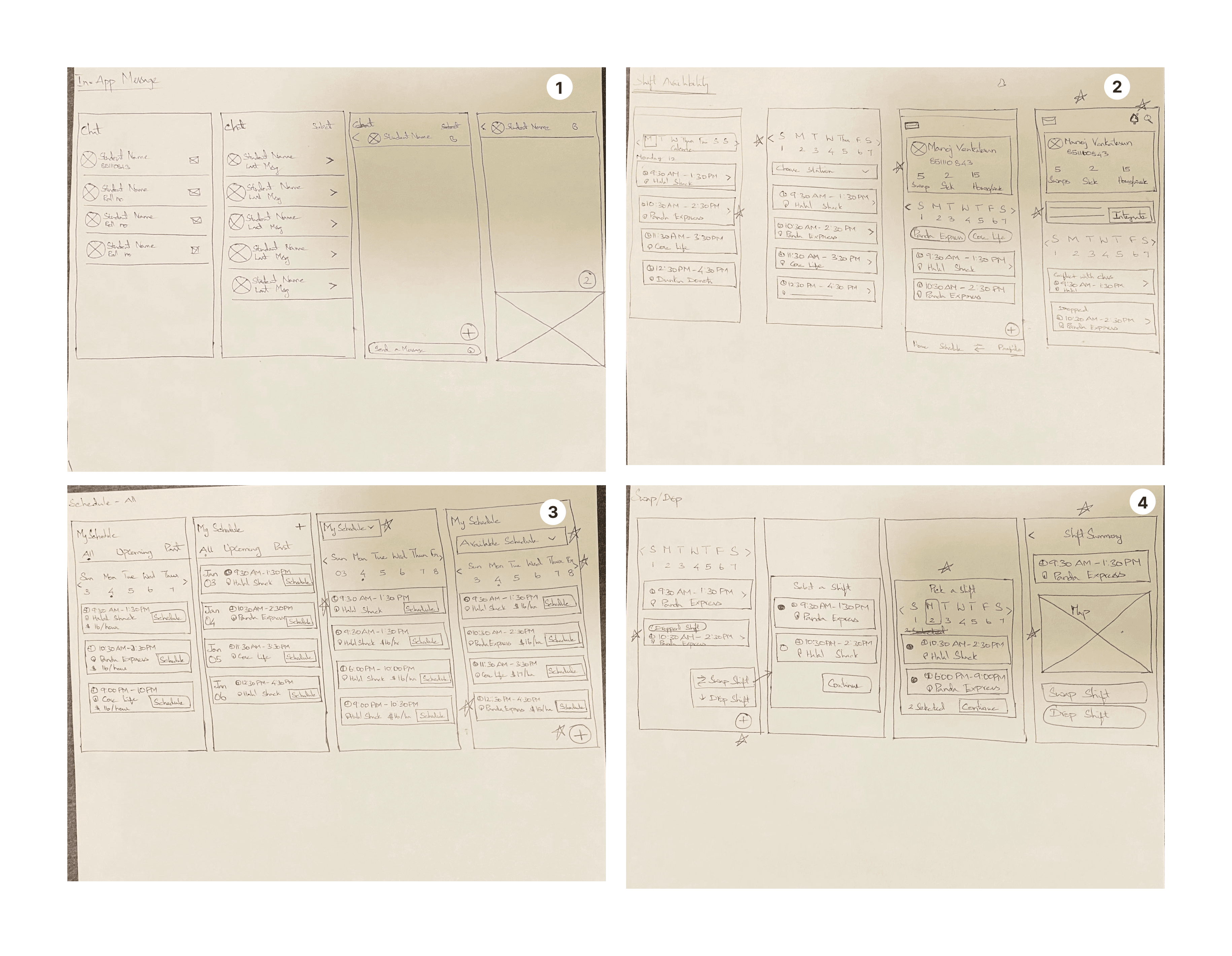
Available shifts: The biggest complaint was that students couldn't see what shifts existed. I designed a list view showing every open shift for the week, grouped by day, with a single "Schedule" button to claim one. I chose a list over a calendar view because interviews showed students think in terms of "what's open tomorrow," not "what does my whole month look like." The list is scannable on a phone with one thumb.
My schedule: Once you have shifts, you need to manage them. This screen shows your upcoming shifts with two clear actions on each: Drop and Swap. I used color-coded status tags (green for confirmed, red for dropped, blue for swapped) so students can scan their week at a glance.
Swap and drop flow: This was the most important interaction to get right because it was the biggest pain point in the old system. I designed a two-step flow: tap "Swap" or "Drop" on any shift, then confirm with a reason. The confirmation step triggers two things: a notification to the supervisor for approval, and the option to message the coworker involved. No need to leave the app or send a separate email.
In-app messaging: Instead of building a generic chat feature, I tied messaging to shift actions. When you swap or drop a shift, the app asks if you want to message your coworker or supervisor about it. This solved the communication problem without creating another messaging app nobody would check. The research showed students were already using 3-4 channels (email, text, GroupMe). I didn't want to add a fifth. So messaging only shows up when it's contextually relevant.
Final Design
Schedule availability screen
The "All Shifts" tab shows every open shift for the current week. Each card shows the time, location (food station), and number of spots left. One tap on "Schedule" claims the shift and adds it to your calendar. No form, no email, no supervisor meeting.
Swap / Drop Screen
The "My Schedule" tab lists your upcoming shifts with Drop and Swap buttons on each. Tapping either opens a confirmation dialog that asks "Are you sure?" with the option to message your team. The supervisor gets a notification and can approve or deny from their own view.
In-app messaging screen
Messaging is contextual, not a standalone chat app. When you swap or drop a shift, the app surfaces a message composer pre-addressed to the relevant coworker or supervisor. You can also open a direct conversation from the Messages tab for anything that doesn't tie to a specific shift.
Design Systems

Results and Impacts
What I delivered: A complete mobile app design (12+ screens) with a component library, interaction specs, and annotated handoff documentation, all built solo over 16 weeks.
Usability Validation: I tested the final prototype with 8 student workers. Key findings:
All 8 participants completed a shift swap successfully on their first attempt, with no guidance needed.
Scheduling a new shift took under 30 seconds in the app, compared to the 30+ minutes students reported with the paper system.
8 out of 8 participants said they'd use the app over the current process.
What happened next: I presented the designs to the Food Service director for consideration
What I learned
I almost skipped the competitor analysis because this was a university project. But finding out that students already had a mental modal for shift-scheduling apps (from Subit Up) changed how I designed the onboarding. I didn't need to teach people what a shift-scheduling app is. I just needed to make ours better for Food Services specifically.