Back
Jobs Ability: Making job search accessible for people with disabilities
I redesigned the Our Ability job-seeker dashboard so people with disabilities could actually find and apply to jobs without hitting accessibility walls at every step.
My Role
Lead UI/UX Designer
Timeline
12 Weeks
Team
1 Designer (me), 2 Front-end Developers, 1 Project Manager

The Problem
Our Ability is a job platform built specifically for people with disabilities. When I joined the platform had a working dashboard, but users were struggling with it in three specific ways.
Profile completion was broken. Users who relied on screen readers couldn't get through the multi-step form. Fields weren't labeled properly, the tab order was wrong, and error messages weren't announced. Most users gave up before finishing.
Job search didn't work for the people it was built for. There were no filters for remote work or experience level, and the search results had no way to show which jobs matched a user's skills. People were scrolling through pages of irrelevant listings.
The UI failed basic accessibility checks. Color contrast ratios were below WCAG 2.1 AA minimums, keyboard navigation was inconsistent across pages, and several interactive elements had no accessible labels at all.
The result: a platform designed for people with disabilities that was, ironically, hard to use if you had a disability.
Research and Discovery
I needed to understand where users were getting stuck, so I ran three types of research over the first two weeks.
User Interviews: I spoke with 10 job seekers who use the platform, including people who navigate with screen readers, keyboard-only users, and people with motor impairments. I wanted to watch them try to do the three core tasks (complete a profile, search for a job, and submit an application) and see exactly where things fell apart.
Survey: I sent a short survey to the broader user base to quantify what the interviews were showing me. 50 people responded. The biggest pain points lined up with what I was hearing in interviews: accessibility issues, poor job matching, navigation confusion, and incomplete profile flows.
Observation: I sat with 5 users while they used the dashboard in real time. This was the most useful research I did, because users would often say the site was "fine" in interviews but then visibly struggle when I watched them actually use it.
Employment challenges
The bigger picture
Before diving into solutions, I looked at the broader employment landscape to ground my design decisions in real data. Two things stood out.
Understanding the job market for people with disabilities requires a comprehensive look at employment rates and the challenges faced in job searching. Here are some key statistics and insights:
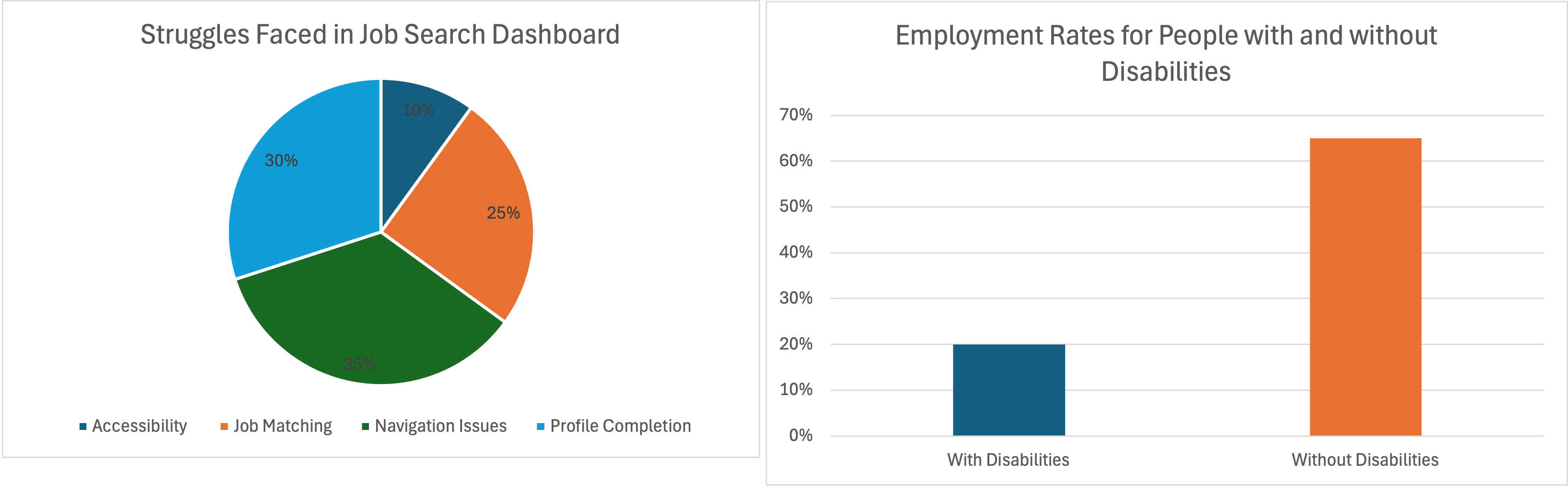
The pie chat comes from our user research. Accessibility barriers were the single biggest compliant, followed by poor job matching and navigation confusion. The employment rate gap (the bar chat) gave me the business case: people with disabilities are employed at roughly 1/3 the rate of people without disabilities. Every friction point on this platform contributes to that gap.
Making sense of the research
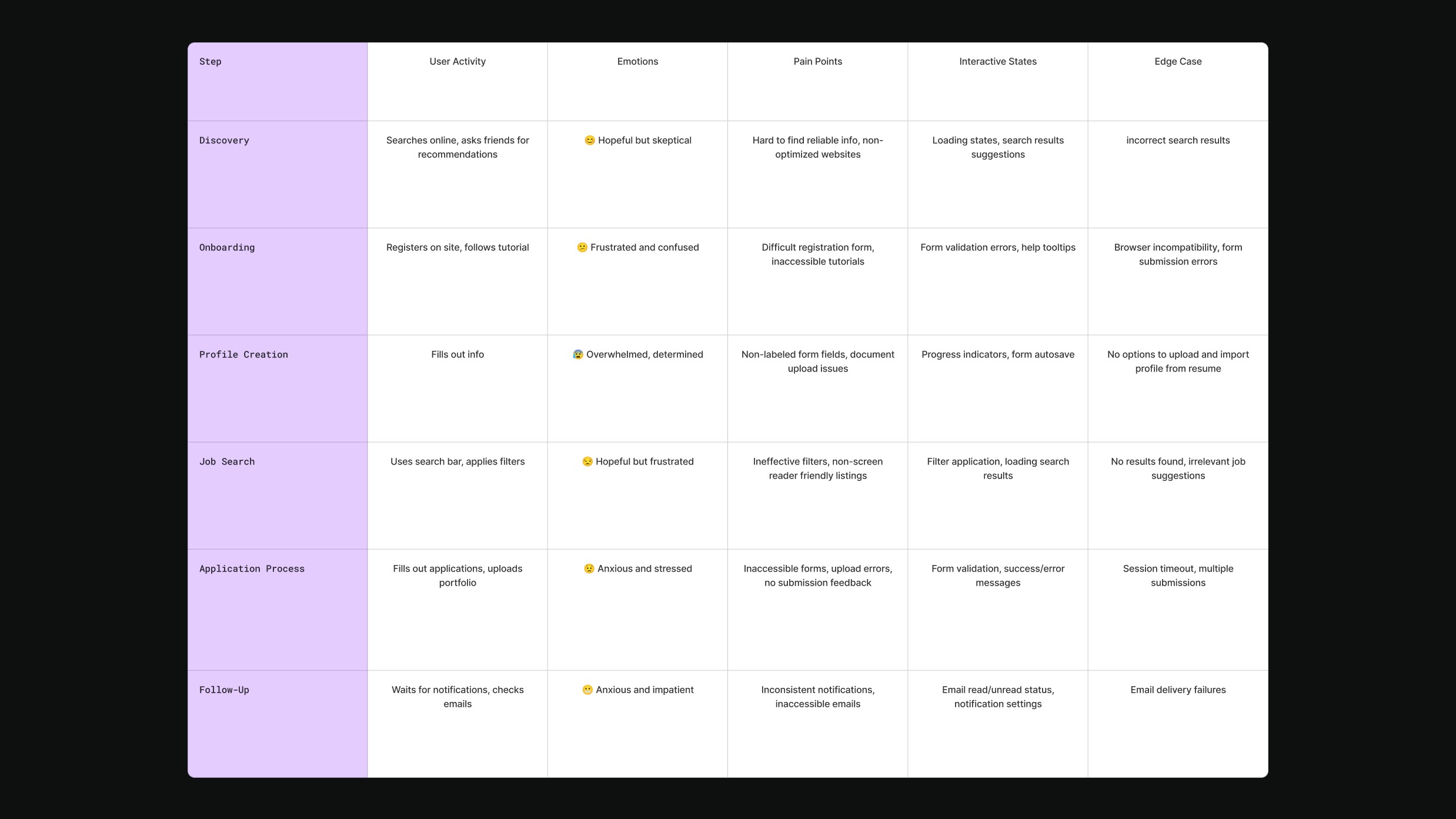
After interviews and surveys, I had a lot of raw notes. I needed to organize it. I built a journey map and an affinity diagram to turn scattered observations into design priorities.
The journey map was the most useful artifact. It showed me that users hit friction at every single stage, from creating an account to getting a response after applying. The worst drop-off was at profile creation. Users would start the form, hit an accessibility barrier (unlabeled fields, broken tab order), and abandon. They never even got to search for jobs.
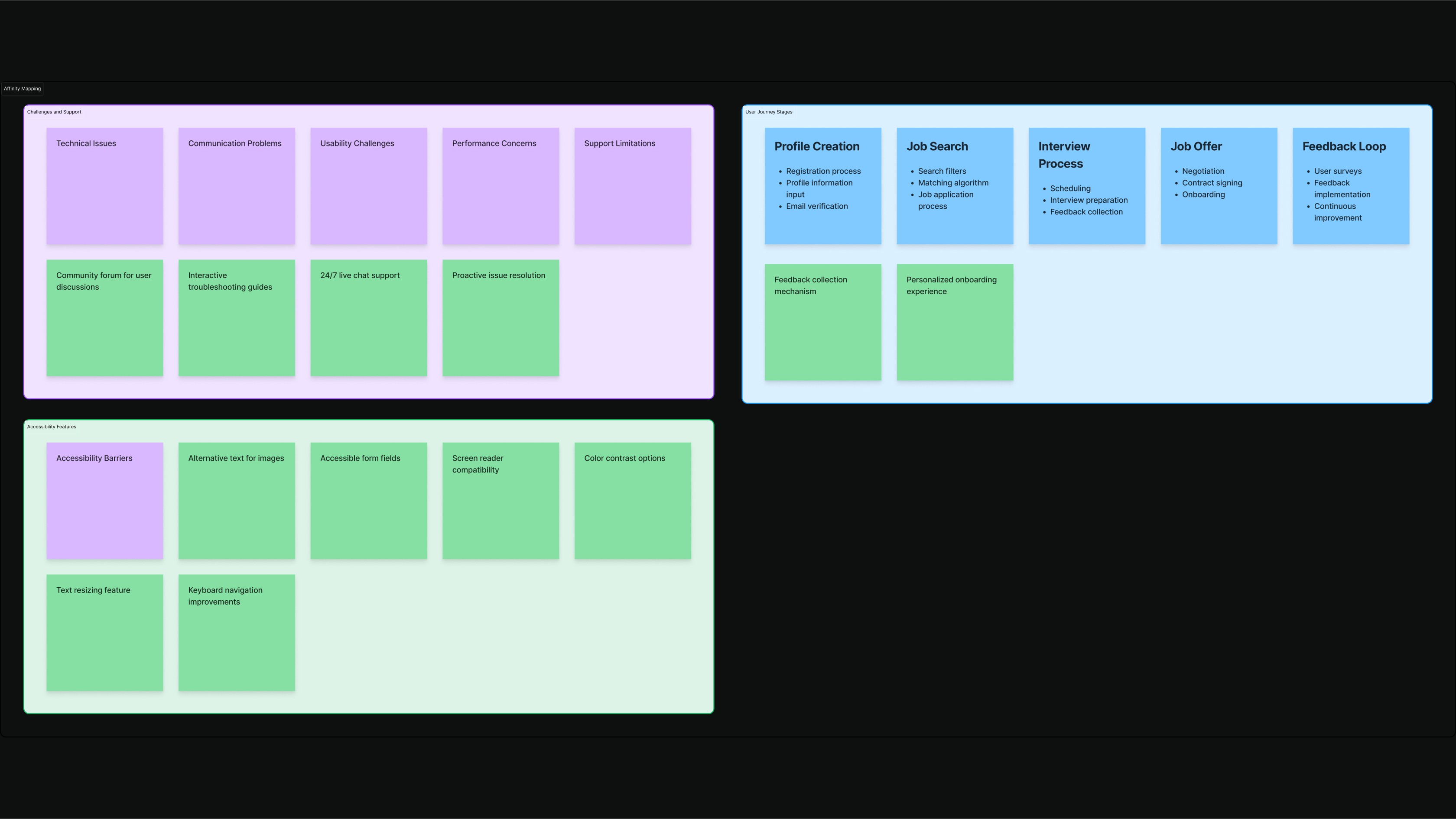
Affinity Mapping
I grouped every pain point from research into categories: technical issues, communication problems, usability challenges, performance concerns, and support limitations.
Three themes kept coming up across all categories: users couldn't complete basic tasks without sighted assistance, the interface gave no feedback when something went wrong, and navigation was unpredictable from page to page. These became my three design priorities.
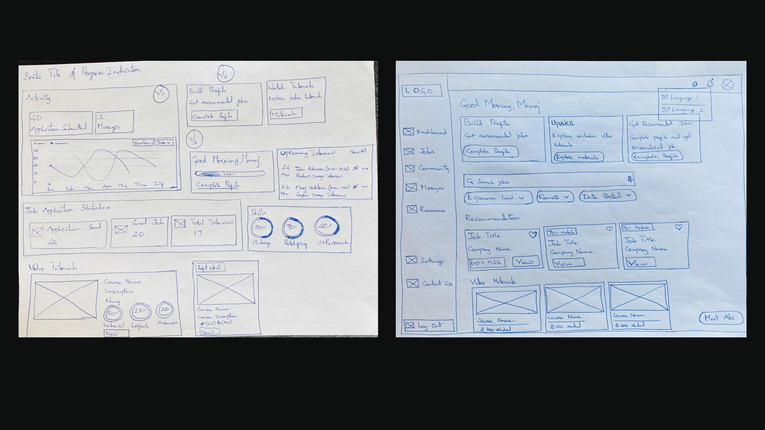
Design Decisions
Dashboard
Simplifying the dashboard to three clear actions
The original dashboard showed everything at once: profile status, job listings, messages, community, resources, tutorials, and settings, all competing for attention on one screen. In testing, users with cognitive disabilities told me it felt like "walking into a room with too many doors."
I restructured it around three priorities: finish your profile, find a job, and prepare for interviews. Everything else moved into sidebar. I chose this order because the data showed most users hadn't completed their profiles yet, and an incomplete profile meant the job matching couldn't work properly. Profile first, then jobs, then prep.
Job Search
Adding filters and match scores to job search
Users were scrolling through every listing manually because there were no filters. For someone using a screen reader, that meant listening to dozens of irrelevant job descriptions before finding one that might be a fit.
I added three filters based on what users asked for most in interviews: experience level, remote/hybrid/on-site, and date posted. I also designed a "Match Percentage" badge on each listing that compares the job requirements against the user's profile. This way, users can scan for high-match jobs first instead of reading every listing. The match score came from conversation with the PM about what data we already had. We had user skills and job requirements in the database but nothing connecting them on the front end.
Application Process
Cleaning up the job detail page and the apply flow
The old detail page was a wall of text. No clear sections, no visual breaks, and the Apply button was below the fold. For a screen reader user, there was no way to skip to the action without listening to the entire page.
I broke the page into labeled sections (description, responsibilities, required skills) with clear headings so screen readers could jump between them. I moved the Apply button to a sticky position at the top of the page. I also added a "Skills Match" sidebar that shows which of the user's skills align with the job, so they can decide whether to apply before reading the full description.

Chatbot
Adding a support chatbot for common tasks
During interviews, I noticed users getting stuck on the same few tasks over and over: Uploading a resume, understanding why a job didn't match, and figuring out how to edit their profile after submission.
Instead of trying to fix every edge case in the UI (which would have taken more than 12 weeks), I proposed a chatbot as a fallback layer. The bot handles three things: profile optimization tips, job search guidance, and step-by-step walkthroughs for common tasks. I pushed for this addition during a sprint planning meeting because the research showed users wanted immediate help, not a help center they had to search through.

Final Designs
Navigation
Every navigation item now has a visible label, an icon, and an ARIA label for screen readers. The sidebar collapses to icons on smaller screens but keep the text available on hover and via keyboard focus.
Profile Completion
I broke the profile form into four clear steps: Personal Info, Education, Work Experience, and Extra-curricular. Each step has a progress indicator at the top so users know where they are. All form fields use top-aligned labels (not placeholder text) because placeholder text disappears on focus and confuses screen reader users. Error messages appear inline, immediately after the field, and are announced by screen readers.
Job Matching
The dashboard now shows a summary view: 80% profile completion, 50 applications submitted, 20 jobs saved, and 5 upcoming interviews. Below that, a line chat tracks application activity over time. I included this because users in testing said they wanted to "see if the platform was working for them," and having visible progress helped them stay motivated.
Accessibility Improvements
Color Contrast
All text now meets WCAG 2.1 AA contrast requirements (minimum 4.5 :1 ratio). I used the Stark plugin in Figma to audit every screen. The dashboard scored 8.08:1 on primary text.

Navigation paths
The profile completion stepper uses clear visual states (completed, current, upcoming) and works with keyboard tab navigation. Each step is focusable and announced by screen readers.
Form readability
Labels sit above each input field with consistent spacing. The old design used side-aligned labels that broke on smaller screens and confused screen readers. New vs. old comparison shown below.
Design System

Results and Impact
Results
What shipped: The redesigned dashboard, profile flow, job search, job detail pages, and chatbot were delivered as a complete Figma design system with annotated specs. The front-end team used these directly as the build template.
Accessibility compliance: The new designs met WCAG 2.1 AA standards across all screens. Color contrast ratios hit 4.5:1 minimum (most exceeded 7.1). All interactive elements have keyboard navigation and screen reader support.
Usability improvements: In testing with 5 users after the redesign, all participants completed the profile setup flow without assistance, compared to 5 out of 10 who couldn't finish it in the original design. Job search time dropped because users could filter instead of scrolling.
Stakeholder response: John Robinson, CEO of Our Ability, said the design "brought our vision into reality" and that "I created the template for our engineers to build." The PM noted the work "exceeded client's expectations/"
What I learned
Accessibility is not a checklist. I went into this project thinking WCAG compliance was about contrast ratios and ARIA labels. It is, partly but the real accessibility problems were structural: a confusing information architecture, forms that assumed mouse input, and a flow that required vision to understand progress. Passing an accessibility audit and being actually useable for someone with disability are two different things.
Consistency matters more when your users rely on patterns. Sighted users can visually scan a page and recover from inconsistency. Screen reader users can't. Every time a button style changes or a navigation patten shifted between pages, it was a dead end for someone who'd learned the pattern on the previous page. This project taught me to treat consistency as an accessibility requirement.
Show your work to users early, even if it's rough. I almost waiting until hi-fi to test with users. I'm glad I didn't. Paper prototype testing caught two navigation assumptions I'd carried forward from the original design. If I'd built those into hi-fi, fixing them would have cost me a full sprint.
Future Enhancement
If I had another 12 weeks, I'd focus on three things:
Mobile. The current designs are desktop-only. Over 60% of job searches happen on mobile, and that percentage is likely higher for users who rely on phones as their primary device. A responsive version would be the single highest-impact next step.
Smarter job matching. The match percentage feature I designed is based on keyword matching between the user's profile and job requirements. A next version could factor in job search history, saved listings, and application patterns to give better recommendations over time.
User testing at scale. I tested with a small group during this project. After launch, I'd want to set up ongoing usability testing with a broader range of disability types, including users with low vision, cognitive disabilities, and motor impairments, to catch issues my initial research may have missed.